Last Thursday I was at First Congregational in Berkeley for the first concert of New Century Chamber Orchestra's season. The program was called Letters from Russia, since it featured the Letter Scene from Tchaikovsky's Eugene Onegin among other Slavic music, but there was some contemporary music featured too, from Jennifer Higdon, this season's featured composer.
The performance opened with Estonian Arvo Pärt's Trisagion, which is Greek for Thrice Holy, and if you know anything about Pärt and his music you will not be surprised to hear that the piece is linked to the Russian Orthodox liturgy, or that it flows with a steady meditative quality, or that it is beautiful. NCCO has such a rich and sometimes even sumptuous sound; yet they can also plink and pluck and be acerbic in the Shostakovich style, as we heard later on. After Pärt's fifteen minutes, Ailyn Pérez came out for Rachmaninoff's Vocalise. She was glittering in a floor-length silver sheath, looking almost incongruously glamorous, like a mermaid just risen from the depths, among the sombre black and purple clothing of the orchestra, there in the austere arches and angles of the colonial New England-style church. She gave a suitably rich performance of Rachmaninoff's flowing line.
And then to close the first half we had sort of a Higdon sampler: Strings, the "quasi-scherzo" second movement of the Concerto for Orchestra from 2002; String Lake, another second movement, this time from All Things Majestic, a 2011 work inspired by the mountainous scenery of Wyoming; and To the Point, an arrangement of the third movement of Impressions, a 2003 string quartet written in response to Impressionist painting as well as the quartets of Ravel and Debussy. (The piece had been commissioned by the Cypress Quartet as part of a series in which composers were asked to respond in some way to a classic of the quartet repertory.) This may sound potentially like a grab-bag mishmash, but actually all three pieces went nicely together, offering enough variety as well as congruity to form a satisfying suite. I'm looking forward to hearing more of Higdon's work (including a world premiere at the season's final concert); there are depths there worth exploring.
After the intermission, the second half started with Shostakovich's Elegy and Polka (also known as Two Pieces for String Orchestra). The first part was shaped from a melancholy, moody aria from his opera Lady Macbeth of the Mtensk District, and the contrasting second part was adapted from his ballet The Golden Age, about a Soviet soccer team traveling to Paris. It sounded suitably sporty.
Then Pérez came out again to perform the Letter Scene from Onegin, in which the naive Tatiana writes a letter declaring her love to the sophisticated, Byronic Eugene Onegin. (It does not turn out well.) Clarice Assad did the arrangement of Tchaikovsky's music. When Pérez entered, she once again (glittering in her silver sheath) looked so glam and sophisticated, so much the opposite of a young country girl like Tatiana, that I wondered how she could possibly convey the character. With vocal skill, it turns out; with a finely detailed, yearning performance. Even with only the English words in the program it was easy to know exactly where she was in the aria, so well-defined was her emotional arc. The orchestra matched her level of passion and precision. What a wonderful thing all around. The applause was so great afterwards that the orchestra did an encore, a piece by Schnittke, whom Music Director and lead violinist Nadja Salerno-Sonnenberg amusingly described as of course "the first name that comes to mind when Russian music is mentioned!"
Next up for NCCO is a holiday concert in December, featuring the San Francisco Girls' Chorus and klezmer clarinetist David Krakauer; that's 17 - 20 December and you can find out more about it here.
Showing posts with label down among the divas. Show all posts
Showing posts with label down among the divas. Show all posts

22 August 2015
The Brooklyn Museum Costume Collection at the Legion of Honor
I have a troubled relationship with Fashion – some would say it's because we've never met, which isn't quite true – so I was not really sure what to expect when V and I headed out to the Legion of Honor in early July to see the exhibit High Style: The Brooklyn Museum Costume Collection.

I believe the show was touring because the collection is being transferred from the Brooklyn Museum to the Costume Institute at the Metropolitan Museum of Art (check here for background on the collection and the move).

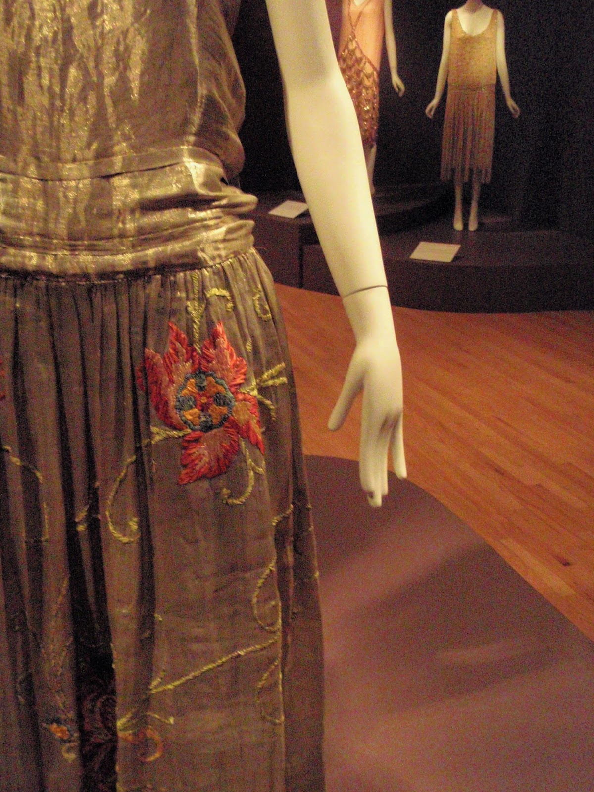
The show turned out to be wonderful. It's not inaccurate to call what we saw "fancy clothes for extremely rich women" but that doesn't really do it justice. Beyond simmering thoughts of class warfare – since we went on V's birthday, I promised her there would be no leftist fulminations from me on behalf of the proletariat; after all, it's not as if I could have had myself painted in a pious attitude in a corner of one of those altarpieces I love, either – the show was a dazzling display of color, form, texture, and ingenuity: painting in another form, or perhaps it was landscaping with cloth and thread.

There were large, somewhat ghostly period photographs of models wearing some of the clothes, which helped reinforce the sense of entering a different and vanished realm.

There were no men's clothes, and no everyday clothes for women, either, or even undergarments; this was a place where there was no everyday life, everything was a special event – a place of fantasy, where even practical necessities turned fanciful. Here are some shoes:


These are more like "sculptures for the feet."

I was not as vigilant as I usually am about photographing labels, so I'm not always sure who the designers are. I did get the label for the shoes below, since it was chockful of interesting information. These are part of the collection of Rita de Acosta Lydig (in a different room, on a different label, we found out that she was the sister of Mercedes de Acosta, an American playwright and poet who is best remembered – this was not on the labels – for affairs with many of the most glamorous and gifted women of mid-twentieth-century stage and screen, including Eva Le Gallienne, Garbo, Dietrich, Nazimova, and, according to rumor, several others, all famous and talented). She was the major client of Yantorny, who had his shoe-maker shop, excuse me I mean atelier, in the Place Vendôme in Paris. He had a sign in the window saying The Most Expensive Shoes in the World, which strikes me as extremely crude and vulgar; surely there was some more sophisticated coded way of saying this.

But he wasn't kidding; the initial deposit for a pair in 1913 was $600, which in today's currency (again, according to the label) would be approximately $10,000. Let me emphasize that that's just the down payment. He also included handmade shoe-trees, designed to be lightweight and hollow. This elaborate wooden carrying case held a dozen shoes, six pairs in each half, so basically it was holding almost double my annual salary (that's just "suggested retail price," without considering rarity, artistry, and historical interest).
But I can look at other artworks without being overly conscious of the cost: why are clothes different? Is it because they're something we all have to buy, in a way we do not have to buy altarpieces and bronzes? Is it some lingering notion that these applied arts are somehow lesser than the fine arts? Only the very rich could afford these items, but then that's true of most art. Was it just because the label brought it up so explicitly (as if to defuse the question)?

Once I got past that shoe label I thought less about money and more about art – actually, art history; it was fascinating to see how the items echoed and played off major artists and artistic movements of their time, starting with the flowing lines, rich colors, and peacock imagery of the Aesthetic Movement:


. . . and up to the tie-dyed 1970s (I think this one is by Yves St Laurent):

Classical Greece was an inspiration, as it has been for Western Art for centuries, and I thought about the neoclassical revival in music (the dress on the left below was one of my favorites):


But you could also see connections with the late-nineteenth / early-twentieth-century fascination with the circus:

and Surrealism:

There were non-Western influences as well, such as the rich colors and patterns of India:

Looking at the hats below, you can see one that was styled on Matisse's cutouts and another on Mondrian's blocks. But the one at far left was modeled on the kepi of the French military, the swirly black one was I think based on an African design, and the one on the bottom was inspired by an aircraft engine (or possibly the propeller). Mamie Eisenhower wore one of these aeronautical hats, which amused V. I think she had not expected such avant-garde styling from Mamie. The designers were wide-ranging and immersed in the world well beyond the little circle of their clientele.

Speaking of surrealists, here's Elsa Schiaparelli's "butterfly dress," the label for which read: "The butterfly, a symbol of transformation – and sometimes death – for the Surrealists, was a ubiquitous motif in Schiaparelli's work. She used it decoratively to represent beauty's emergence from the mundane. This icon expressed the designer's philosophy that chic clothes and a sense of style could transform the ordinary into the extraordinary." OK. Am I reading too much into it to find it amusing that the label-maker sees "chic clothes" and "a sense of style" as two separate things?
Anyway I like the butterflies, and particularly enjoyed seeing this dress against its backdrop photograph.

Next to the butterfly dress was another Schiaparelli, the swell little number below, which V loathed. I didn't mind it, and was entertained by her loathing, though I should note that my half-hearted attempts to defend it (because seriously, why should I defend it? what difference does it make to me?) ended up sounding slightly condescending to the dress: it's cute. It's fun. V was having none of it. She thought it was a rich woman mocking middle-class or agrarian women, and let the record show that I was not the one on this trip who brought up Marie Antoinette playing shepherdess. Who's an anarcho-syndicalist now, babe?


Still seething at Schiaparelli (a phrase I never, ever thought I would write), V was further irritated by the astrological symbols on the jacket below, though she was a bit mollified when a label said that the designer's use of planets and stars was a tribute to her beloved uncle, an astronomer (not astrologer), with whom she spent many childhood hours studying the nighttime skies. I also suggested to V that astrology was acceptable as a decorative motif, even for a math and science teacher like herself. I don't know if that helped.

We moved on from Schiaparelli. V liked the dress below very much.


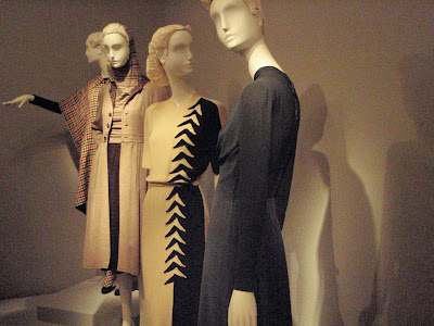
The name comes from the bold arrow-like inserts (red on the front, dark purple on the back) pointing up towards the breasts . . .

. . . and down towards the butt. (The dark purple below might show up a bit better if you can click to enlarge the photo.)

I forget the name of the woman who designed the tart dress, but she intended it as a feminist statement. I guess "being exploited for your sexuality" and "being 'empowered' by owning your sexuality" have been doing their little dance for quite some time. Nothing too surprising there. I thought the tart dress was stylish and bold, but honestly I'm not sure it's any more pointed than something like the Worth gown below, dated 1907 - 1910, which I photographed because it put me in mind of highly respectable females in the novels of Edith Wharton and Henry James. You can see that the neckline is quite low, and those flowing insert things (I think they were beaded) also underscore and draw attention to the breasts.

And you'd have to be a bold woman indeed to wear the dress below, inspired by the grandeur that was Greece and the glory that was Rome:

With a neckline like that, a red arrow would not really be necessary. You wouldn't even have fabric to put it on. (This is a different dress from the Grecian ones shown above.)
Though I was thinking a lot about different art movements while walking through the exhibit, I wasn't thinking that much about things like gender roles (that is most definitely not a complaint), because the slice of the world we're seeing here is so rarefied anyway, and these costumes (and that really is the right word) are so fanciful and often eccentrically individualistic. I'm not sure a woman could wear some of them twice – like the dress made out of huge poppies shown earlier; that sure struck me as a one-off.
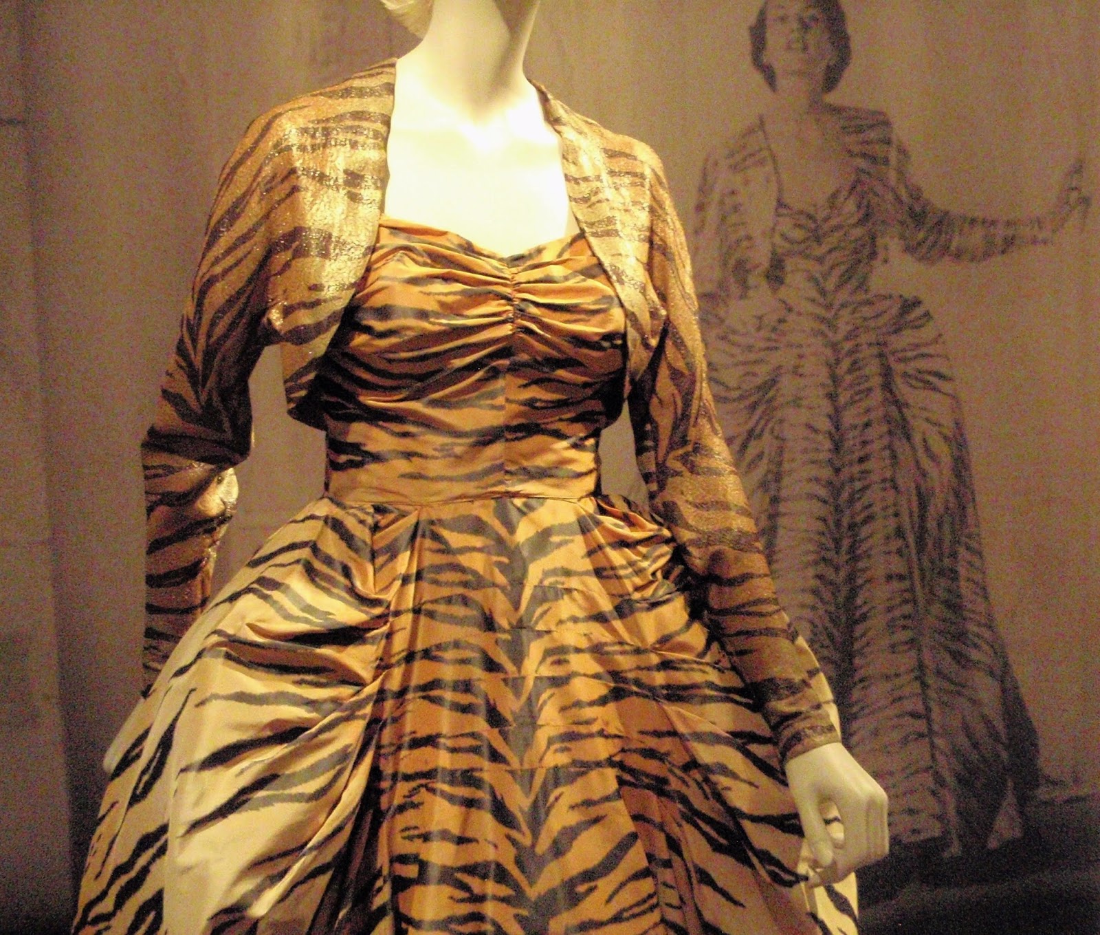
But I guess the tiger dress below is meant as a sly comment on women as both predator and prey. I love tigers anyway, preferring them to lions, who always seem a bit worn out. We overheard one of the guards telling someone that the model in the backdrop photo, now an elderly woman, had come to see the show, and that she was incredibly charming and gracious. I felt oddly happy hearing that.

I'm really not sure what's going on with the big red flower on the dress below. Wouldn't it get in your way while you were reaching for a canapé? It seems sort of floppy and lopsided. I suggested to V that the dress would be improved if someone tore it off and she agreed. The big red flower was the only really egregiously puzzling thing we saw. Why did this seem like a good idea to the designer?


Many of the gowns in the last couple of rooms were by American designer Charles James. Below is his Ribbon dress from 1946. The construction of the skirt, with its variety of colors, forced a fuller silhouette on the hips, which is why V did not like this dress, as she felt it accentuated them in a way that would be unflattering for most women. (It was designed with a particular client in mind, who was described in such glowing terms – her intelligence, her taste, her daring – that I wanted to see a portrait of her, but there was none; the dress stood on its own without its intended occupant.) Maybe it was that sort of farthingale thing going on in the hips that brought to mind an earlier century and a theatrical setting; I liked this dress and its colors and subtly contrasting textures and it put me in mind of the commedia dell'arte.

It seemed like something Columbina might wear in a really luxe Harlequinade, or an outfit Watteau would paint on a woman standing among the feathery leaves of shady melancholy trees.

The shoes and hats were all in vitrines, but only one of the dresses was: Charles James's Cloverleaf dress. There was a very interesting video in one of the rooms showing its elaborate construction. None of my photographs do it justice, as you really need an aerial view. The first one below gives you some idea of how it sweeps out in four distinct directions.


Here's a close-up of the lace. There were several versions of this dress, it seems, some of them in solid colors. This one was quite elaborate, with the lace and the rich fabric.

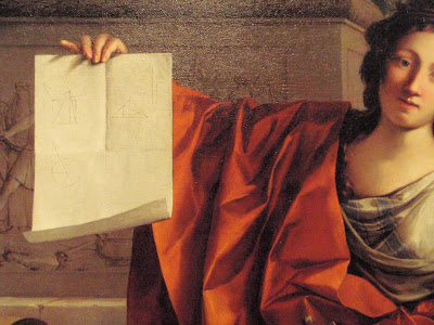
It was a triumph of engineering, and apparently James felt that way too. Seeing it and its mathematically produced elegance gave extra force to the Allegory of Geometry by Laurent de La Hyre (detail below) that we later saw in the baroque gallery.

The gowns seemed to conjure up a whole vanished world of wit and elegance, a world that of course never existed: the women who wore these artworks were humans who would sweat, weep, defecate, struggle with or succumb to various appetites, who had blemishes, could get tired or sick, would grow old and die. These dresses were designed to float them above all that, at least temporarily, and above the rest of us. These fragile, easily damaged costumes seem monumental, like protective armor over fragile, easily damaged people.

This phantom world was evoked so splendidly that after a while I began to wonder if actually we were the ones who were ghosts, flitting through a borrowed world and then vanishing unregarded.


I believe the show was touring because the collection is being transferred from the Brooklyn Museum to the Costume Institute at the Metropolitan Museum of Art (check here for background on the collection and the move).

The show turned out to be wonderful. It's not inaccurate to call what we saw "fancy clothes for extremely rich women" but that doesn't really do it justice. Beyond simmering thoughts of class warfare – since we went on V's birthday, I promised her there would be no leftist fulminations from me on behalf of the proletariat; after all, it's not as if I could have had myself painted in a pious attitude in a corner of one of those altarpieces I love, either – the show was a dazzling display of color, form, texture, and ingenuity: painting in another form, or perhaps it was landscaping with cloth and thread.
There were large, somewhat ghostly period photographs of models wearing some of the clothes, which helped reinforce the sense of entering a different and vanished realm.

There were no men's clothes, and no everyday clothes for women, either, or even undergarments; this was a place where there was no everyday life, everything was a special event – a place of fantasy, where even practical necessities turned fanciful. Here are some shoes:


These are more like "sculptures for the feet."

I was not as vigilant as I usually am about photographing labels, so I'm not always sure who the designers are. I did get the label for the shoes below, since it was chockful of interesting information. These are part of the collection of Rita de Acosta Lydig (in a different room, on a different label, we found out that she was the sister of Mercedes de Acosta, an American playwright and poet who is best remembered – this was not on the labels – for affairs with many of the most glamorous and gifted women of mid-twentieth-century stage and screen, including Eva Le Gallienne, Garbo, Dietrich, Nazimova, and, according to rumor, several others, all famous and talented). She was the major client of Yantorny, who had his shoe-maker shop, excuse me I mean atelier, in the Place Vendôme in Paris. He had a sign in the window saying The Most Expensive Shoes in the World, which strikes me as extremely crude and vulgar; surely there was some more sophisticated coded way of saying this.

But he wasn't kidding; the initial deposit for a pair in 1913 was $600, which in today's currency (again, according to the label) would be approximately $10,000. Let me emphasize that that's just the down payment. He also included handmade shoe-trees, designed to be lightweight and hollow. This elaborate wooden carrying case held a dozen shoes, six pairs in each half, so basically it was holding almost double my annual salary (that's just "suggested retail price," without considering rarity, artistry, and historical interest).
But I can look at other artworks without being overly conscious of the cost: why are clothes different? Is it because they're something we all have to buy, in a way we do not have to buy altarpieces and bronzes? Is it some lingering notion that these applied arts are somehow lesser than the fine arts? Only the very rich could afford these items, but then that's true of most art. Was it just because the label brought it up so explicitly (as if to defuse the question)?

Once I got past that shoe label I thought less about money and more about art – actually, art history; it was fascinating to see how the items echoed and played off major artists and artistic movements of their time, starting with the flowing lines, rich colors, and peacock imagery of the Aesthetic Movement:


. . . and up to the tie-dyed 1970s (I think this one is by Yves St Laurent):

Classical Greece was an inspiration, as it has been for Western Art for centuries, and I thought about the neoclassical revival in music (the dress on the left below was one of my favorites):


But you could also see connections with the late-nineteenth / early-twentieth-century fascination with the circus:

and Surrealism:

There were non-Western influences as well, such as the rich colors and patterns of India:

Looking at the hats below, you can see one that was styled on Matisse's cutouts and another on Mondrian's blocks. But the one at far left was modeled on the kepi of the French military, the swirly black one was I think based on an African design, and the one on the bottom was inspired by an aircraft engine (or possibly the propeller). Mamie Eisenhower wore one of these aeronautical hats, which amused V. I think she had not expected such avant-garde styling from Mamie. The designers were wide-ranging and immersed in the world well beyond the little circle of their clientele.

Speaking of surrealists, here's Elsa Schiaparelli's "butterfly dress," the label for which read: "The butterfly, a symbol of transformation – and sometimes death – for the Surrealists, was a ubiquitous motif in Schiaparelli's work. She used it decoratively to represent beauty's emergence from the mundane. This icon expressed the designer's philosophy that chic clothes and a sense of style could transform the ordinary into the extraordinary." OK. Am I reading too much into it to find it amusing that the label-maker sees "chic clothes" and "a sense of style" as two separate things?
Anyway I like the butterflies, and particularly enjoyed seeing this dress against its backdrop photograph.

Next to the butterfly dress was another Schiaparelli, the swell little number below, which V loathed. I didn't mind it, and was entertained by her loathing, though I should note that my half-hearted attempts to defend it (because seriously, why should I defend it? what difference does it make to me?) ended up sounding slightly condescending to the dress: it's cute. It's fun. V was having none of it. She thought it was a rich woman mocking middle-class or agrarian women, and let the record show that I was not the one on this trip who brought up Marie Antoinette playing shepherdess. Who's an anarcho-syndicalist now, babe?

She particularly hated the pocket, which was one of the seed packets appliqued on the side. "Don't miss the pocket! Take a picture of that pocket!" I've known V almost forty years, and this is the closest I've come to hearing her actually hiss something.
Here's that pocket!:

Fun!
I thought one could accessorize the seed-packet dress with the Schiaparelli insect necklace below, but V was not buying it. "You don't make fun of farm women," was her final word on the matter.
I liked this necklace. The bugs are realistically molded, but painted in bright colors that make them, or at least some of them, look artificial. On their clear backing, it would look as if they were floating unsupported around your neck, to creepy and thrilling effect.

Still seething at Schiaparelli (a phrase I never, ever thought I would write), V was further irritated by the astrological symbols on the jacket below, though she was a bit mollified when a label said that the designer's use of planets and stars was a tribute to her beloved uncle, an astronomer (not astrologer), with whom she spent many childhood hours studying the nighttime skies. I also suggested to V that astrology was acceptable as a decorative motif, even for a math and science teacher like herself. I don't know if that helped.

We moved on from Schiaparelli. V liked the dress below very much.

Sometimes I became aware of how well the show was lit. The lights were generally dim, as they are for drawings or woodblock prints or other delicate works, in order to protect the fragile materials, but there were some effective spotlights.

The dress on the right below is called the "tart" dress. It looks quite respectable from this angle, and honestly my first, rather clueless, thought was "small pies? huh?" By process of elimination (no small pies were visible!) I realized that, yes, they meant the female kind of tart.

The name comes from the bold arrow-like inserts (red on the front, dark purple on the back) pointing up towards the breasts . . .

. . . and down towards the butt. (The dark purple below might show up a bit better if you can click to enlarge the photo.)

I forget the name of the woman who designed the tart dress, but she intended it as a feminist statement. I guess "being exploited for your sexuality" and "being 'empowered' by owning your sexuality" have been doing their little dance for quite some time. Nothing too surprising there. I thought the tart dress was stylish and bold, but honestly I'm not sure it's any more pointed than something like the Worth gown below, dated 1907 - 1910, which I photographed because it put me in mind of highly respectable females in the novels of Edith Wharton and Henry James. You can see that the neckline is quite low, and those flowing insert things (I think they were beaded) also underscore and draw attention to the breasts.

And you'd have to be a bold woman indeed to wear the dress below, inspired by the grandeur that was Greece and the glory that was Rome:

With a neckline like that, a red arrow would not really be necessary. You wouldn't even have fabric to put it on. (This is a different dress from the Grecian ones shown above.)
Though I was thinking a lot about different art movements while walking through the exhibit, I wasn't thinking that much about things like gender roles (that is most definitely not a complaint), because the slice of the world we're seeing here is so rarefied anyway, and these costumes (and that really is the right word) are so fanciful and often eccentrically individualistic. I'm not sure a woman could wear some of them twice – like the dress made out of huge poppies shown earlier; that sure struck me as a one-off.
But I guess the tiger dress below is meant as a sly comment on women as both predator and prey. I love tigers anyway, preferring them to lions, who always seem a bit worn out. We overheard one of the guards telling someone that the model in the backdrop photo, now an elderly woman, had come to see the show, and that she was incredibly charming and gracious. I felt oddly happy hearing that.
I'm really not sure what's going on with the big red flower on the dress below. Wouldn't it get in your way while you were reaching for a canapé? It seems sort of floppy and lopsided. I suggested to V that the dress would be improved if someone tore it off and she agreed. The big red flower was the only really egregiously puzzling thing we saw. Why did this seem like a good idea to the designer?

The dress below, however, struck me as cool (in every sense) and delightful; if it were blue and green instead of red I would consider it a perfect summer dress. It's almost like a superhero costume: if you're wearing this, you're marked out as someone with special powers, distinctive, not of this sweaty realm.

Since some consider the movies the great twentieth-century art form, it's not surprising that Hollywood and the fashion world played back and forth. The dress below, by the Fontana sisters of Italy, was worn by Ava Gardner in The Barefoot Contessa. In classic movie star style, she was apparently shorter than she looks on screen.


It seemed like something Columbina might wear in a really luxe Harlequinade, or an outfit Watteau would paint on a woman standing among the feathery leaves of shady melancholy trees.

The shoes and hats were all in vitrines, but only one of the dresses was: Charles James's Cloverleaf dress. There was a very interesting video in one of the rooms showing its elaborate construction. None of my photographs do it justice, as you really need an aerial view. The first one below gives you some idea of how it sweeps out in four distinct directions.


Here's a close-up of the lace. There were several versions of this dress, it seems, some of them in solid colors. This one was quite elaborate, with the lace and the rich fabric.

It was a triumph of engineering, and apparently James felt that way too. Seeing it and its mathematically produced elegance gave extra force to the Allegory of Geometry by Laurent de La Hyre (detail below) that we later saw in the baroque gallery.

Below is another James gown, the Siren. Some of the dresses had such a powerful presence that a mannequin would have lessened the aura. The frocks just stood there, absolute. I would do what this dress told me to do.

The gowns seemed to conjure up a whole vanished world of wit and elegance, a world that of course never existed: the women who wore these artworks were humans who would sweat, weep, defecate, struggle with or succumb to various appetites, who had blemishes, could get tired or sick, would grow old and die. These dresses were designed to float them above all that, at least temporarily, and above the rest of us. These fragile, easily damaged costumes seem monumental, like protective armor over fragile, easily damaged people.


When we left the exhibit it was actually raining outside, heavily enough so that we delayed leaving. Even a light rain is a remarkable thing to happen in California in early July, and though any precipitation is welcome during this drought, it seemed like another sign that larger unseen patterns were shifting around us.
After a brief walk to the bus stop, we hopped on the #1 California bus and headed to Chinatown, where we had a very enjoyable dinner, at a place we've gone to for years.

06 June 2012
Speak Low
A few weeks ago I heard Ute Lemper and Dawn Upshaw on successive days. I have heard both performers live before and I like them both very much. But the two recitals were contrasting illustrations of how technology can work against and for a performance.
Lemper performed with the Vogler Quartet (Tim Vogler and Frank Reinecke on violin, Stefan Fehlandt on viola, and Stephan Frock on cello) and with Stefan Malzew (on clarinet, accordion, and piano). The program looked inviting: songs and instrumental works from and influenced by Weimar-era Germany, including Schulhoff, Edith Piaf, Weill, Eisler, Piazolla, and Jacques Brel. Lemper has a striking presence (she looks like John Singer Sargent’s Portrait of Madame X) and a louche glamour perfectly suited to her repertoire. So far so good. Now we come to the amplification.
Someone said to me later, “But you must have expected that she would be amplified.” Yes, I went in knowing that she’s a cabaret singer and they generally use microphones. I read something recently about the microphone enabling a singer to sound as if she’s whispering in your ear. That’s great, but they can also make a singer sound as if she's shouting in your ear. And all of the instrumentalists were amplified as well, which I really wasn’t expecting. Maybe that wouldn’t have been a problem if the sound mix hadn’t been so awful. During the second half, after making various gestures to the sound man indicating what she wanted modified, Lemper just started speaking to him from the stage, which kind of broke the mood. I think she ended up happy with the sound, though I did not. I really tried to get past it. It wasn’t a problem for me last time I heard her (but that time I had been sitting halfway back in very large Davies Hall, not up front in very intimate Herbst Theater). Far from increasing the intimacy, the bludgeoning volume made me feel I was being shouted at for a couple of hours, which is exhausting.
To further increase the alienation, the songs were in French, German, Russian, Yiddish, and Spanish, and there were no texts or translations provided (there was a little English thrown in there as well, in the Brecht/Weill songs). I’m touched by her mostly unwarranted faith in our linguistic versatility. Lemper spoke before or after each song, but only occasionally did she give us some idea of what the song was saying, and frankly after a while it all started blending together. That was partly intentional; she was pointing out cross-currents and similarities in wide-ranging cultures, but if you’re going to do that for two hours you need to differentiate and vary the moods. Mostly the inter-song segments were vaguely atmospheric spiels about plucky refugees wandering from city to city with their one little valise of songs, or jaunty denizens of the demimonde disappearing with the dawn, laughing at the loss of their last centime – a smile, a shrug, another bottle of wine you can’t afford, to forget another love you can’t afford to remember. That’s all very well, and appealing in small doses, but with repetition such poses can seem increasingly sentimental and evasive, ignoring the grinding exhausting wearing-down caused by poverty, exile, and drug abuse.
Sadly, despite her efforts and mine, she lost me long before the end. For an encore we had the Kurt Weill/Ogden Nash song Speak Low, stretched out with a glittering display of scat-singing that was both dazzlingly virtuosic and interminably self-indulgent, completely missing the tender heart of the song.

I was back at Herbst the next night to hear Dawn Upshaw with Stephen Prutsman on piano. Before the performance Ruth Felt, head of San Francisco Performances, came out to announce they were trying something new, and she hoped we would all let them know what we thought of it: they were using surtitles for the recital. She sounded a bit uncertain and hesitant during the announcement, as if this were some bizarre experiment and not a long overdue and very welcome change to the recital format. I’ve been saying for years that they should use surtitles during recitals, and Upshaw’s performance proved how right I was. (I have to mention this to make up for the times I'm very wrong.) For once we didn’t have endless rustling, folding, turning, and creasing of pages during the songs; we could watch the singer (and the words behind her) rather than the program on our laps; the houselights didn’t need to be up so we could read, and the darkened room helped create an intimate, concentrated bond with the singer. Finally, a use of technology that enhances rather than undercuts live performance!
Of course Upshaw had much to do with setting the mood and creating the bond. But the overdue use of surtitles helped remove the barriers between us and her. This recital had been rescheduled from January, and it’s well known that Upshaw has had some serious health issues, so I’m happy to say she was in beautiful voice, much better actually than the last time I heard her, about a year ago. The song selection was also innovative; instead of sets, there was a continuous series of dreamy, moody songs, gentle and sad and lovely and loving, by composers ranging from Monteverdi, Purcell, and Dowland to Schubert and Schumann to Berg and Messiaen to Golijov, Weill, and Vernon Duke (though the songs were arranged by emotional rather than chronological order).
I’m sure someone in the audience had some silly objection to the surtitles but I can’t imagine what it would be, and I don’t much care. Some people will object to any change. My only suggestion would be prefacing the words with the title of the song and the composer, so that there’s no need to check the program. There were no surtitles for the English-language songs; I was fine with that though I can see that some might prefer them. I hope recital surtitles catch on; I keep hearing that the vocal recital is a hard sell and a dying form, but surtitles heighten the form’s unparalleled intimacy and directness of communication. Why shouldn’t surtitles expand the audience for recitals the way they have for opera?

Subscribe to:
Posts (Atom)